YMCA Twin Cities
Checking in at the YMCA
The YMCA of Greater Twin Cities needed a a way to expedite the member check-in process at their gyms and branches during peak hours. So we built an new iOS app that allows employees to scan membership cards on the fly.
- RoleUX · UI · Prototyping
- Year2015
- EmployerFFW Agency

The Problem
The YMCA of Greater Twin Cities serves more than 250,000 members across more than 25 locations in Minneapolis and St. Paul. This makes it one of the largest YMCAs in the US – but that success also comes with a set of challenges.
One such challenge is handling the large number of members checking into gym during peak hours. Employees working at the front desk are often under a lot of pressure to scan membership cards, while also assisting with other inquiries during peak hours. This challenge prompted the need for a new, more portable, check-in solution, that the staff could utilize to help expedite the check-in process during busy times.
Problem Statement
How might we design a mobile solution that allows YMCA employees to speed up the check-in process at their gyms during peak hours? The solution must be be fast, simple and cost-effective.
The Team
As the sole designer on the project, I was responsible for all things design-related; from research and ideation through UX and UI design to prototyping and testing. I worked closely with a Project Manager and iOS Developer, who made up the rest of the team.

User Research at the YMCA
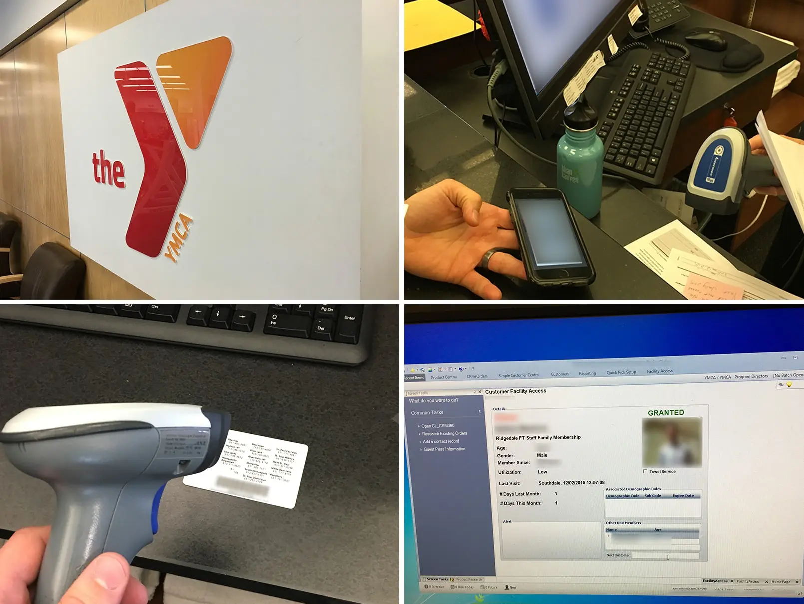
In order to fully understand the challenge with the existing check-in flow, I visited the Southdale YMCA branch in Minneapolis. Here I was introduced to the existing check-in system, and saw how the staff handled member check-ins.
A big part of the problem was that the staff could only check in members using a sole scanner hooked up to stationary desktop computer behind the front desk. That meant that during rush hour, lines would start to form at the front desk, as staff struggled to simultanously scan membersip cards and answer other questions and inquiries from behind the desk.

Findings
Observing and talking to the staff at Southdale led to a number of useful insights and findings to help guide the design process:
- Employees need to be able to quickly and easily tell if a check-in is successful or failed, when they scan a card.
- Employees rely on profile photos to verify members' identities, when they scan their cards – so being able to see a large photo is important.
- Each member has a "nickname", which is their preferred name for being addressed by staff. These need to be easy to read, when a card is scanned.
- The solution should must portable, so that it can also be used at outdoor events or in other situations, where member cards need to be scanned.
Make it Portable – and Fast
From my initial research and conversations with YMCA employees it was clear that a simple – and very feasible – solution would be to design an iOS app for iPhones, which could be used as portable check-in devices. Having a portable device would allow staff members to get out from behind the desk and check in members right at the entrance, thus clearing up the front desk to handling the more time-consuming tasks.


To validate that this was also a technically feasible idea, we researched several barcode scanning technologies; from software frameworks that utilize the built-in camera to hardware sleds that attach to the phone. A deciding factor for choosing a solution was speed – if the scanning process wasn't fast, it wouldn't help solve the problem during peak hours. Throughout the design phase we tested several solutions, but in the end we settled on Scandit, which uses the built-in camera to scan membership cards, and thereby saves the added cost and hassle of acquiring additional hardware.
Designing the User Flows
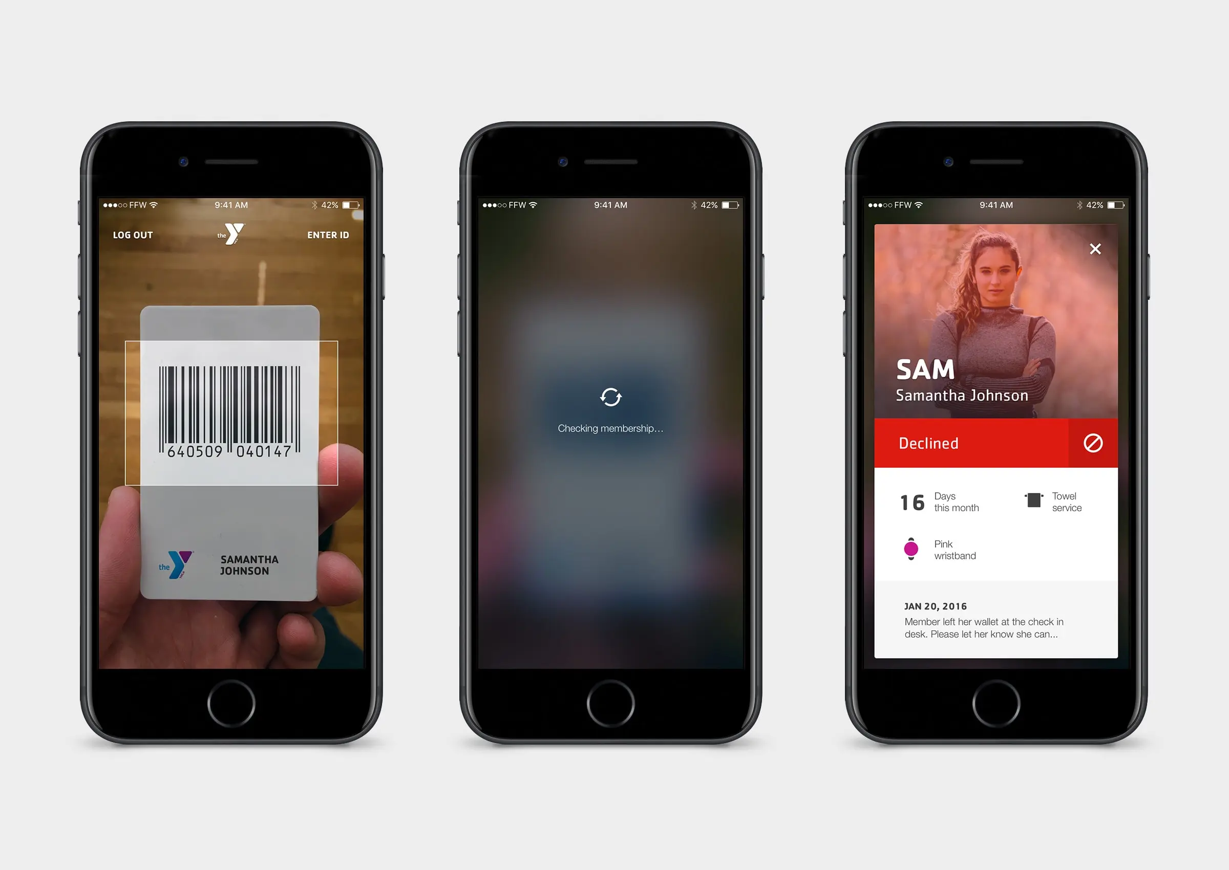
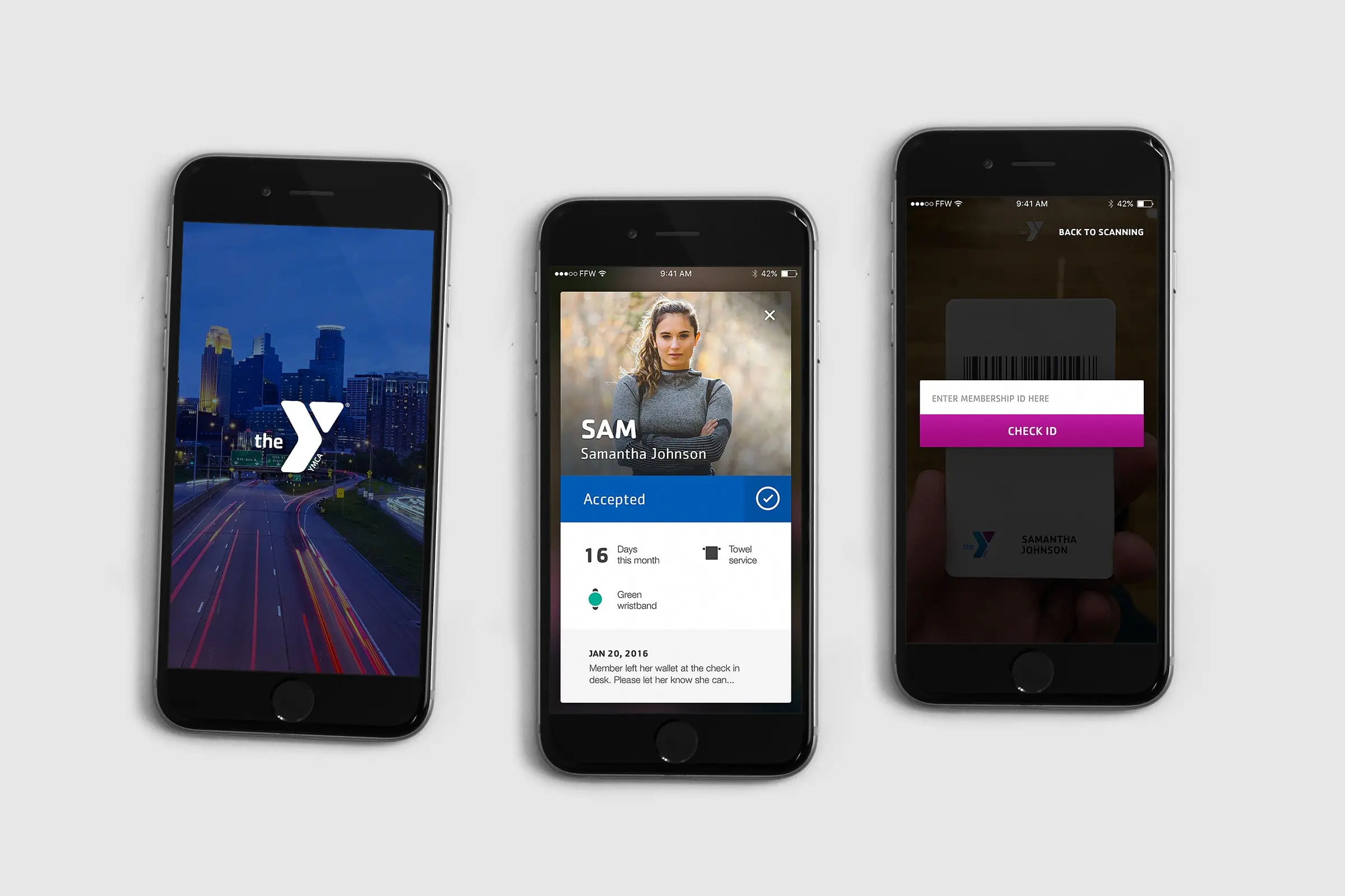
With a clear understanding of the problem, I now dove into the designing out the app. While the app also needed to cover several secondary user flows – such as changing a member photo, manually entering a member ID, or reading alerts about a membership – the primary user flow for the app was clear: scanning a membership card.
I took rapid and iterative approach to designing this primary flow, testing several designs in order to zero in on a final user experience that would feel both inviting and fast. The UI had to immediately make it clear whether or not a member check-in was successful, and quickly allow the employee using the app to move on to the next check-in.
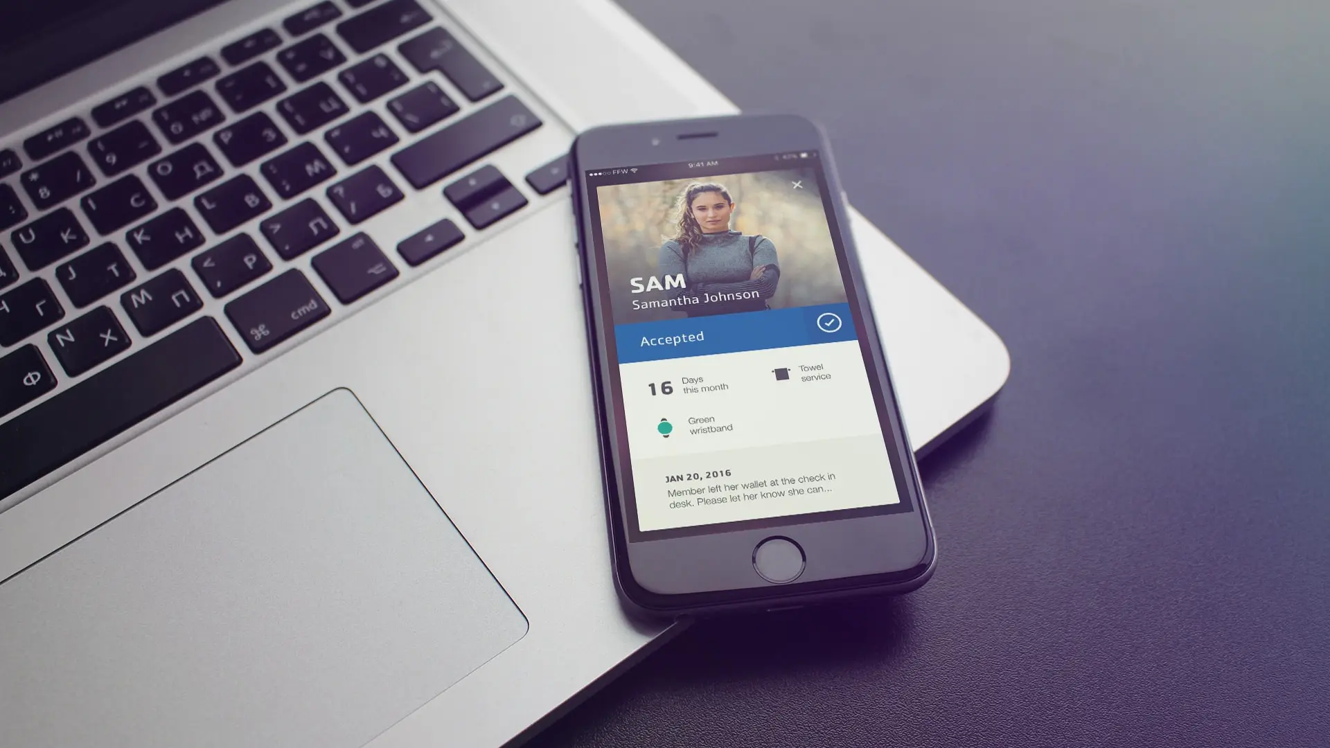
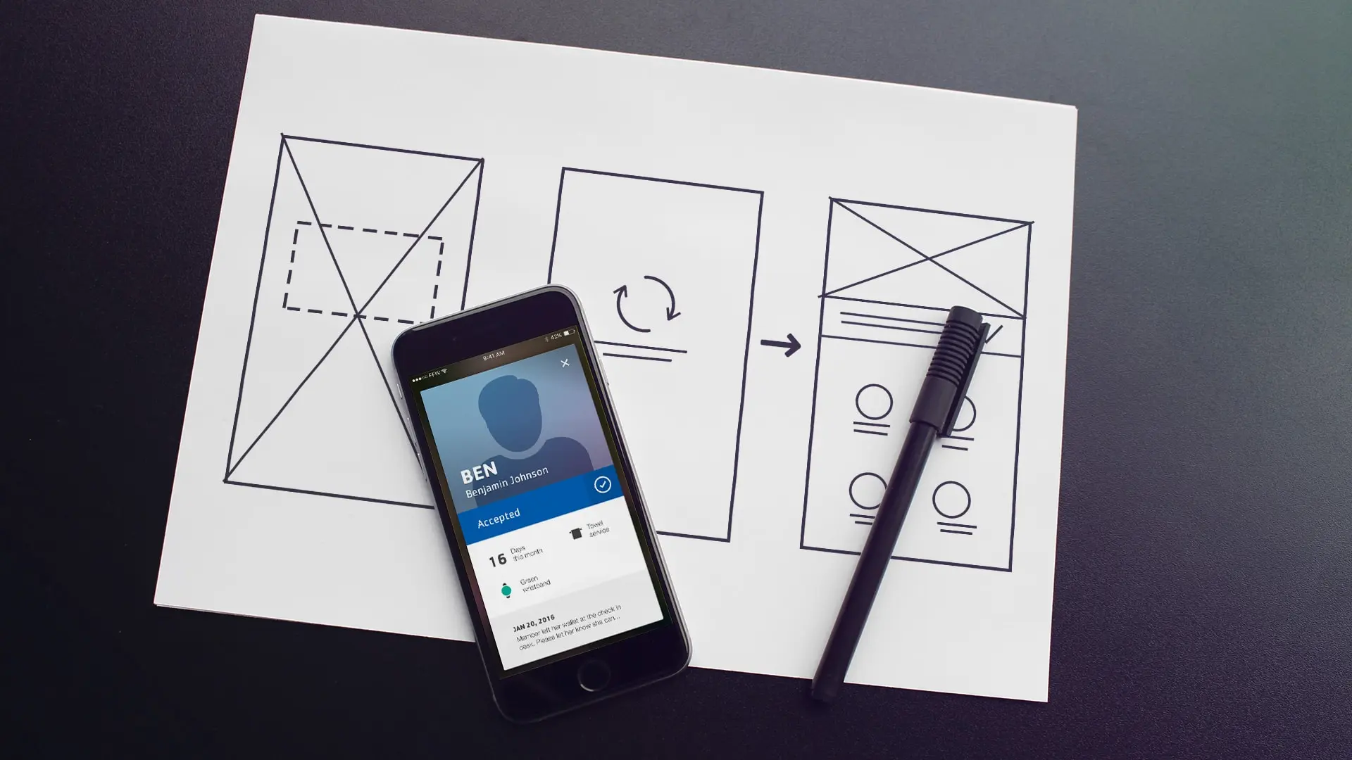
After several ideas and sketches, I opted for a card-based design pattern that pops up a virtual card, whenever an employee scans a membership card. The UI uses bright colors and text to quickly communicate whether a check-in is succesful or not, and a simple downward swipe dismisses the card again.
Prototyping Interactions
As I designed the app, I also continually prototyped the interactions in Principle. Prototyping the app allowed me to easily test, tweak and refine the details of the key micro interactions in the app – things like animation speed and easings – to ensure a smooth, but snappy user experience. Furthermore, it allowed me to perform quick ad hoc user testing to verify that the design patterns made sense and worked as intended.
The Result
The final result is an iOS app that is both simple and highly focused in its utility; it allows YMCA staff members to either scan a membership card or to enter the card number manually, in case the scan should fail. When a card is successfully scanned, the app loads a digital member card that shows whether or not the check-in was accepted, and displays the basic information that the staff needs. Some of the key design choices include:
- In order to make sure employees can tell at a glance if a check-in was succesfful the app uses a light blue (a YMCA brand color) to denote a succesful check-in, and a bright red to denote a failed check-in.
- The app prominently shows both member photo and nickname to allow employees to easily verify a member's identity and greet them appropriately.
- The app relies only on the built-in camera and an internet connection, so can be used anywhere that the iPhone has a wireless data connection.
This initial version of the app serves as an MVP and is currently being tested in several of the YMCA Twin Cities branches. It is the intention to iterate and improve further on the app, and add new features as the need arises.